I went to the Urban Center (at the Municipal Art Society) to see the New York City Streets Renaissance "exhibit," an undertaking of The Open Planning Project. I don't recommend making the trip, as it's mostly just text and pictures posted on the wall with some video clips, all of which are available online. That's not to say the project itself isn't worthy, but the gist of it can be had by clicking over to NYCSR. One of the better videos is about Hell's Kitchen under seige by traffic. But the best video is about how neighborhood activists forced DOT to redesign Canal Park, a triangular plot of land in Tribeca, and rerouted traffic entering the Holland Tunnel. The video really shows how these efforts can be a win-win for everyone: traffic flow is far better, pedestrians are no longer being run down, and the neighborhood gets a lovely park space.
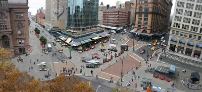
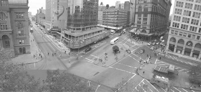
The above photos are of Astor Square, as is and reimagined (click to enlarge the photos, and check out how they surrounded The Cube with seating and moved it to the north so it's the first thing you see when you come out of the Astor Pl. subway station). Having criss-crossed this area hundreds of times, including the traffic island where The Cube currently is, I can attest to the fact that this is not a well designed space. NYCSR points out that Astor Square is an important transition area between one neighborhood and another (Greenwich Village and the East Village), and yet it's a dead zone. And it really is.
My criticism is that many of the design recommendations start to look the same ... umbrella seating here, there and everywhere.

The Astor Square redesign is probably the most detailed, but many of the other recommendations seem to be just about widening the sidewalk and reducing the space allocated to cars and trucks. There must be some cost-benefit analysis here about how reducing all this traffic space would affect the commerce of the city.
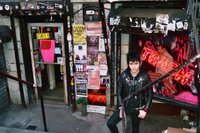
 The other thing is, and I'm not one to pooh-pooh streetscaping improvements, but there does come a point where prettying things up too much kills a neighborhood's spirit. St. Marks Pl., for example, between 2nd and 3rd Avenues (the block I live on), is infuriating to walk on with all the kiosks and tourists and punk kids and drug addicts. But it's St. Marks Place! What would living in the E.Vil. be if you weren't infuriated on occassion? So, sure, let's fix the dead zone that is Astor Square. But the litmus test, as I see it, is whether or not a space is actually dead or just "unattractive" to some eyes (click to enlarge photo of Trash and Vaudeville on St. Marks).
Related Posts:
- Check out this photo I took of The Cube during the holidays.
- Check out another Polis post on how the Bowery could be enlivened by widening and landscaping the traffic median.

